Instagram has blossomed into one of the top platforms for personal expression and brand development. One of the strongest ways to carve out a niche and attract attention is by crafting an impressive color theme. Let me walk you through everything you need to know about making your Instagram pop with a well-curated color theme.
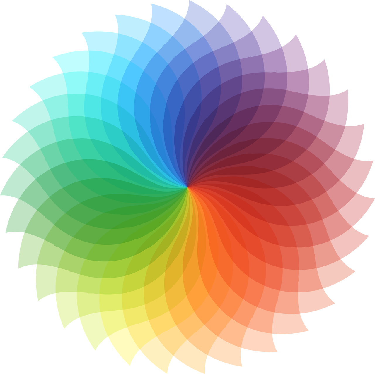
Color Kuler: Your Ally in Theme Creation
Color Kuler is a tool that’s become indispensable for anyone interested in creating a vibrant Instagram feed. Here’s how you can use Color Kuler to refine your Instagram palette:
Color Kuler helps analyze and extract color palettes from any image. This can be a photo you love, or even your current Instagram post. You just need to upload your image, and Color Kuler will display precise color details. These colors can then form the foundation of your Instagram theme.
For example, when I started building my Instagram color theme, I used a vibrant sunset photo I took in Santorini. By uploading this picture into Color Kuler, I extracted hues of deep indigo, warm oranges, and soft pinks. These gave my feed a cohesive and aesthetically pleasing appearance.
I recommend using Color Kuler whenever you feel your Instagram color theme needs a refresh. This simple tool keeps the creative juices flowing and ensures that your color game remains strong.
Instagram Theme Color Code: The Secret Sauce
Understanding the Instagram theme color code is essential in ensuring that your posts look cohesive. It’s not enough to just pick colors; these shades need to tell a story and blend beautifully on your grid.
A color code is essentially a hex value representing a particular color. For example, the color code for classic Instagram pink is #fccc63. Each color has its distinct code, and using these systematically across your posts guarantees a uniform look.
I recall a time when a friend was struggling with a mishmash of colors on her posts. After doing a little experiment with color codes, she settled on shades of teal and peach. It’s funny how just knowing a simple color code can transform an entire Instagram profile from chaotic to creative.
Here’s a tip: Try selecting one or two primary colors and a couple of secondary shades. This way, you have flexibility while still staying true to your theme.
Best Colors for Instagram Posts
Selecting the best colors can be a daunting task, but fear not! Certain tried-and-true shades seem to perform exceptionally well on Instagram.
While color choices can be subjective, consider this: Cool tones like blues and greens often evoke calmness and trust, making them perfect for brands wanting to convey stability. On the flip side, warm tones such as reds, oranges, and yellows are attention grabbers that exude energy and passion.
For instance, when promoting my pottery brand, I leaned heavily into earthy tones like terracotta and slate blue. These colors evoked a sense of authenticity and craftsmanship that resonated with my audience.
Remember, your audience plays a significant role in choosing colors. Analyze what resonates with them, and don’t be afraid to adjust if a particular hue isn’t making the expected impact.
Instagram Color Palette Generator: Let Technology Do the Work
What if selecting colors wasn’t a manual process? Enter Instagram color palette generators. There are online tools specifically designed to help create palettes tailored for Instagram.
Palette generators work by selecting the main color of a photo you upload, then providing complementary shades for you. Tools like Canva or Colorkuler allow you to experiment with these colors before committing them to your theme.
When I felt uncertain about my color choices for a travel-themed feed, I relied on a color palette generator. It gave me a fresh perspective, allowing me to see combinations I hadn’t considered. The ease of use was a lifesaver, and I felt like a creative genius without much of a headache!
Harness technology’s power—it’s there to make our creative life easier!
Instagram Colour Palette Analysis: Breaking Down the Rainbow
Don’t shy away from a bit of Instagram colour palette analysis. Think of this as evaluating, instead of deciding.
Dig deeper to ensure your colors speak the message you envision for your brand or page. Analyze tones that fit within your selected palette. Conduct little experiments by posting in drafts to see how your grid would look before making those posts public.
A personal experience comes to mind when I revamped a friend’s Instagram page for her photography work. Initially, her photos didn’t have a place until we analyzed the tones. Once she committed to primarily dark and moody colors, her work screamed drama and flair. The difference was night and day!
Instagram is not about the perfect picture; it’s about the cohesive story told by the colors complementing those images.
How to Create an Instagram Color Theme?
Creating a color theme on Instagram is simpler than it sounds. Here’s a step-by-step guide:
-
Identify Your Inspiration: Start by figuring out what prompts your color theme. It could be emotions, places, seasons, or anything that makes you tick.
-
Choose Your Color Scheme: Stick to three to four colors. This way, there’s variety without overwhelming your aesthetic.
-
Plan with a Grid: Before posting, place your photos in a nine-square grid. Ensure each post complements others surrounding it.
-
Consistency is Key: Use the same filters or editing techniques for uniformity.
-
Evaluate and Adjust: After a few weeks, review your progress. Are the colors working? Don’t hesitate to tweak for better results.
Once I decided to create a beach-themed feed purely using muted blues and soft sand shades, it attracted beach lovers who appreciated the serene vibes. It taught me the real power of consistency and planning.
What is My Instagram Color Palette Free: Tools Worth Exploring
Are you ever curious, “What is my Instagram color palette free?” Well, various free tools help analyze existing Instagram feeds and suggest potential colors you can use going forward.
Tools like YearOfColor look at your past year’s posts to identify the dominant colors you’ve used. Imagine having a personalized color history highlighted for you!
Once, I was at a loss after trying different sets and themes. Using YearOfColor made me realize that pastels were my protagonists. It set me on a new path of utilizing and mixing past factors with new inspirations for a better theme.
These tools are free, and they’re undoubtedly beneficial resources every Instagram enthusiast should explore.
How Do You Get Custom Colors on Instagram?
Creating custom colors on your Instagram means going beyond the usual shades available within the app. Let me show you how.
First, utilize photo editing apps like Adobe Lightroom or VSCO that offer advanced color editing. For creating specific shades, adjust hues, saturations, and contrasts creatively—this is where custom colors shine.
Next, remember that Instagram Stories offer a hidden gem. When choosing text or brush colors, hold down on the color option to find a color spectrum. Swipe around to create custom hues right there!
On countless occasions, when I wanted just the right coral hue for my story, this was my go-to method. It saved time and gave me precisely that vibrant punch.
The takeaway: Custom colors give your profile a unique identity that generic filters can’t match.
How to Make a Color Theme on Instagram Reels
Instagram Reels present a different challenge when addressing color themes. The concise video format demands your colors still embrace the theme without overpowering.
Firstly, pre-plan the colors. Use the same lighting and backdrop colors across different reels. Consider wearing consistent hues if you’re in the video.
Secondly, filters. The right filter makes all the difference. Explore tools like InShot or Adobe Rush, where you can maintain continuity with a favorite filter effect.
For example, say you’re focusing on a boho-theme. I experimented once by choosing mustard yellows and olive greens as my reel’s dominant colors. Every prop and outfit decision revolved around this. It created vibrant, eye-catching clips that not only stuck to my theme but allowed the vibe to come alive!
So, Embrace the vibrancy of Reels while committing to your palette.

How to Get a Color Palette on Instagram Story
Instagram Stories can be strategic because they’re an extension of your feed. Ensuring your color theme flows from posts to stories can elevate your entire Instagram presence.
Start by using Instagram’s built-in tools like the color picker for text or shapes. It aligns elements within your story to existing post colors.
Incorporating story templates from services like Canva, where you tailor palettes matching your brand colors, adds finesse. Furthermore, when posting strong imagery, ensure it’s consistent with your chosen hues.
A friend dealing in sustainable fashion stores her month’s Instagram stories in a highlight featuring eco-friendly shades of green. Her audience not only connects with her messaging but separates her brand visually from competitors.
Remember, consistency breeds recognition.
How Do You Change the Color of Your Instagram Theme?
Sometimes, a change in an Instagram theme’s color helps refresh and re-engage your audience. Here’s a simple guide should you desire to switch it up:
-
Reflect on Your Intentions: Why change? Who are your new target followers? What feel do you wish to convey?
-
Research and Be Inspired: Look into trends, explore mood boards, and gather examples on platforms like Pinterest.
-
Launch Softly: Test small changes. Adjust filters minimally and see audience reaction.
-
Set a Transition Plan: Gradually blend old colors with new ones. Ensure your grid transitions without jarring color shifts.
-
Embrace Feedback: Ask your viewers if they find the new theme eye-catching or if it complements your content.
Your flexibility keeps your content fresh while staying within the framework of what’s artistically “you.” A little change now and again does wonders!
Color themes are a wonderful playground for creativity on Instagram. There’s nothing more satisfying than transforming your posts into a work of art that tells your story visually. Ready to shine your colors brilliantly across the grid? You’ve got all the tools and know-how, and I can’t wait to see what you’ll come up with next.
FAQs
Q: Is it necessary to have a color theme on Instagram?
A: While not necessary, a color theme enhances your aesthetic appeal, making your brand memorable to followers.
Q: How often should I change my Instagram color theme?
A: There’s no specific frequency. Change as per your content needs or audience feedback. If your theme feels outdated or doesn’t resonate anymore, that might be the time to refresh it.
Q: Are there apps to post uniformly within a theme automatically?
A: Certain apps like UNUM or Planoly allow planning the grid to ensure posts stay consistent with your theme.
“Colors, like features, follow the changes of emotions,” said Pablo Picasso. Let your Instagram be a canvas, and may your colors express the multitude of emotions you wish to convey.